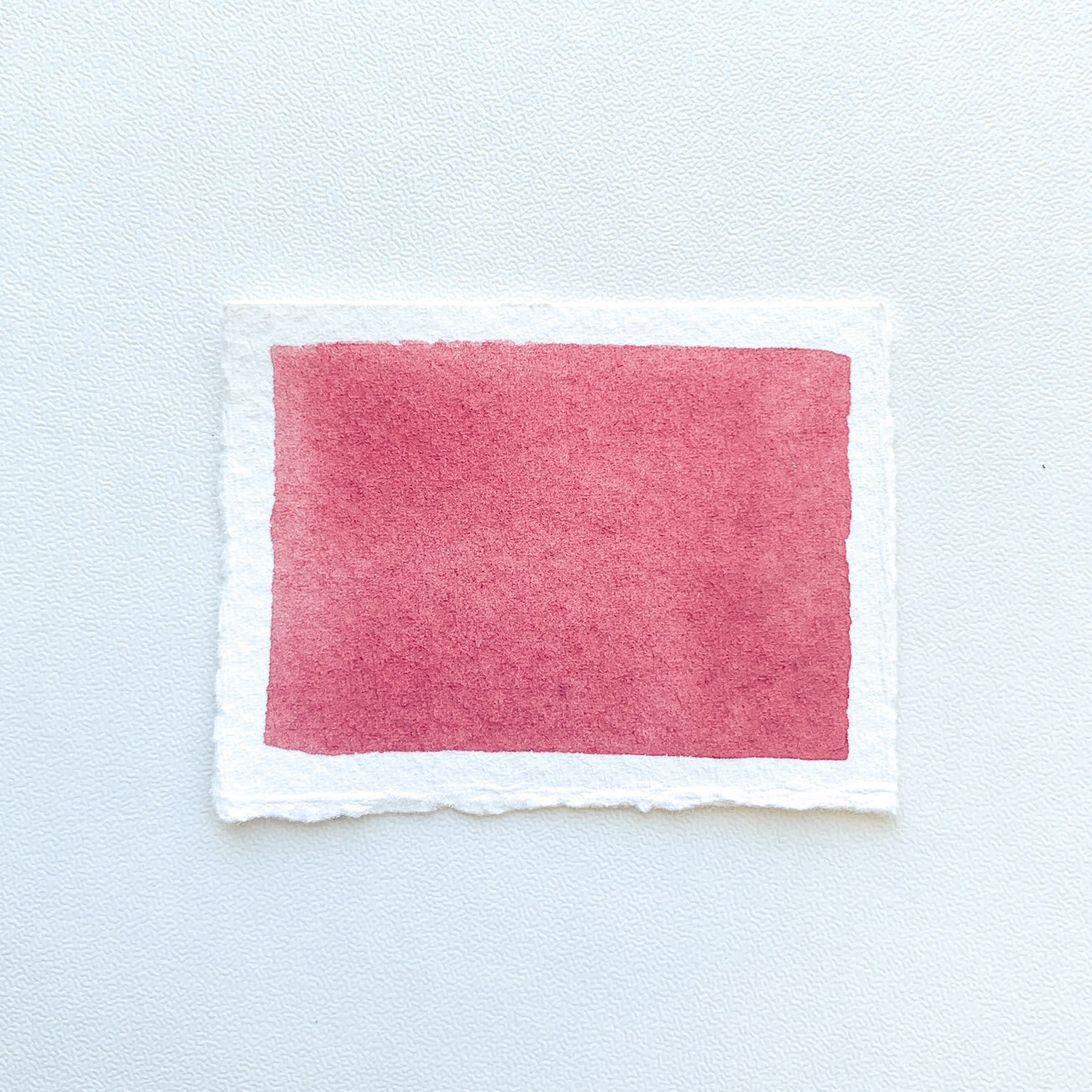
Vintage Pink
I’ve never really been into pink. I love blue and green and yellow, but if you ask what my favorite color is I’ll say red. Pink has never featured. Up until a few years ago… I actually surprised myself and found a shade of pink I liked.
And then, pink turned out to be pretty cool.
It has many names, it probably started with Millenial Pink, although I prefer Vintage Pink or Vintage Rose. It’s kind of pink, but not quite, and almost lavender, but definitely not purple, you know the one I mean? That pinky mauve color.
Randomly, this color has made its way into my house in several different ways, unintentionally.
First as a t-shirt I was given, then when I chose ‘Rosewood’ for a linen duvet and finally ‘Vintage Pink’ for a pen. And they all turned out to be almost the exact same shade. You can’t even make that happen if you’re trying to match a color. So started the slight obsession.
So now I set about to mix the same shade with watercolor paint. Let me show you what I came up with. (All paint used is Daniel Smith Extra Fine Watercolor, and I’ve listed the pigment numbers in bold too!)
The first mixes.
Quin Violet PV19 + Quin Burnt Orange PO48
Indian Red PR101 + Quin Violet PV19
Quin Violet PV19 + Pyrrol Scarlet PR255 + Buff Titanium PW6:1
All of these made beautiful colors, I was particularly impressed with Indian Red + Quin Violet. But they all leaned too red so none quite matched the color I wanted. So it was back to the drawing board, so to speak. I went for more blue based mixes the second time around.
The second mixes.
Indanthrone Blue PB60 + Pyrrol Scarlet PR255
Quin Violet PV19 + Indian Red PR101 + Quin Burnt Orange PO48 + Indanthrone Blue PB60 + Buff Titanium PW6:1
Quin Violet PV19 + Pyrrol Scarlet PR255 + Buff Titanium PW6:1 + Prussian Blue PB27
These ones turned out much closer. I was really interested to see some of the results with these color mixes, Indanthrone Blue + Pyrrol Scarlet is really beautiful! It’s always fun to experiment!
My perfect shade of vintage pink.
I decided the last mix of Quin Violet, Pyrrol Scarlet, Buff Titanium and Prussian Blue matched the best. I was very happy with this one! I think it matches almost exactly.
Perhaps one of the others is your perfect shade though, go mix some, it’s lots of fun!
I hope you liked this little insight into some of my color mixing.


